Dark Mode Best Practice and Tips
Apr 18, 2023
In this article, we’ve put together our best tips to help you get the most out of your emails in dark mode when it comes to your HTML, your imagery and the colours of your email.
What code to include in your Email Design System
You can include some HTML and CSS in the <head> of your email, and this means you can set specific colours and images to appear when someone views your email in dark mode.
The first thing to do is add in the relevant dark mode meta tags in the <head> of your HTML. This means dark mode will be enabled in your HTML and your dark mode styling will get used (where it is supported) for those who are viewing in dark mode.
<meta name="color-scheme" content="light dark"><meta name="supported-color-schemes" content="light dark">
Now, you can include the below dark mode media query in a <style> tag to add in specific styles when an email is viewed on dark mode. For example, if we wanted to change the background colour and text colour in dark mode.
@media (prefers-color-scheme: dark ) {.dark-bg { background-color: #272623 !important; }
h1, h2, p, span, a, b { color: #ffffff !important; }}
You can also duplicate the dark mode media query and use a [data-ogsc] prefix to make sure that the dark mode styling is supported on Outlook app on Android.
@media (prefers-color-scheme: dark ) { [data-ogsc] .dark-bg { background-color: #272623 !important; }
[data-ogsc] h1, [data-ogsc] h2, [data-ogsc] p, [data-ogsc] span, [data-ogsc] a,[data-ogsc] b { color: #ffffff !important; }}
Then you can use these dark mode classes wherever you need throughout your HTML.
<table bgcolor="#ffffff" class="dark-bg">
Use transparent PNGs for your images
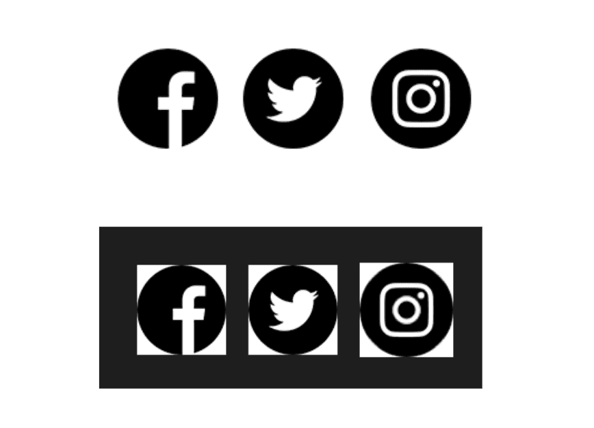
If you have images, such as social media icons, that have a white background as part of the image and your emails use a white background. Before dark mode, this wouldn’t have been an issue. However, if the background colour is inverted to a darker hex code, you’ll be left with a white block around your images.
Using transparent PNGs can lead to a much cleaner looking email in this scenario. The background colour behind the image will now match the rest of the email.

Outlines around logos and icons
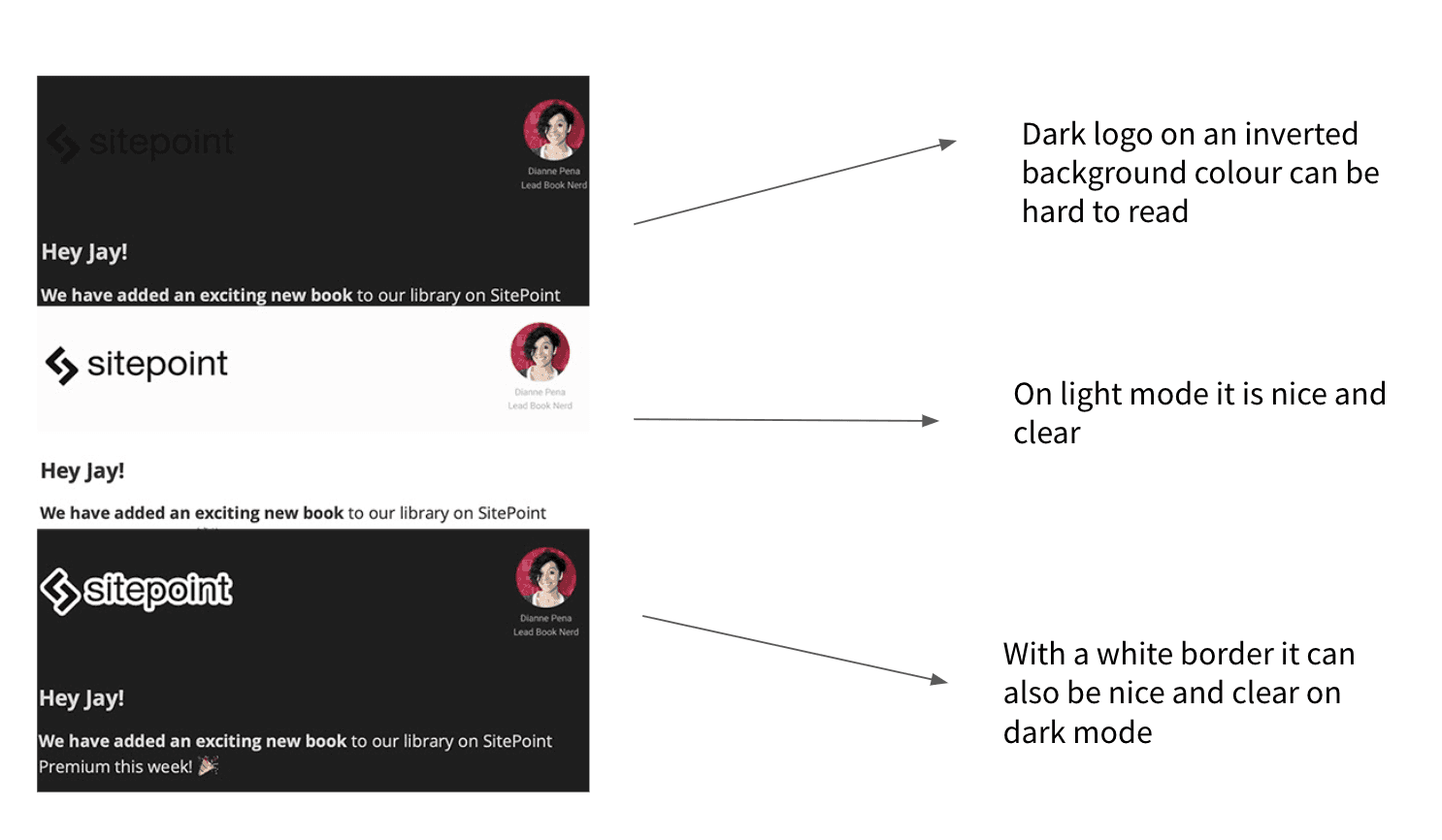
If you have a dark logo, or dark social media icons, which you could swap out for a more dark mode appropriate image using a media query. However, as these aren’t supported everywhere, you could be left with a black logo on a black background. So anyone opening your email on dark mode won’t be able to see a massive part of your brand.
Adding a slight white border to the darker logos is a common way to make sure your logo or any other icons are visible for everyone who opens the email.

Consider how you are using text over image modules
In the email clients that ignore dark mode media queries but apply their own dark mode logic to colours, such as Windows 10 or Gmail App on Android, background images will be left alone but the text on top will be inverted to a darker colour.
If your original design has light text above a darker image, text getting inverted to a similarly dark colour can make the text difficult to read.
One option is to make sure that you use a background image with more neutral colours so when the text colour gets changed it doesn’t blend in with a darker image. Similarly, you could make sure you use neutral colours for the text on top of the image.
However, this isn’t always an option depending on brand guidelines.
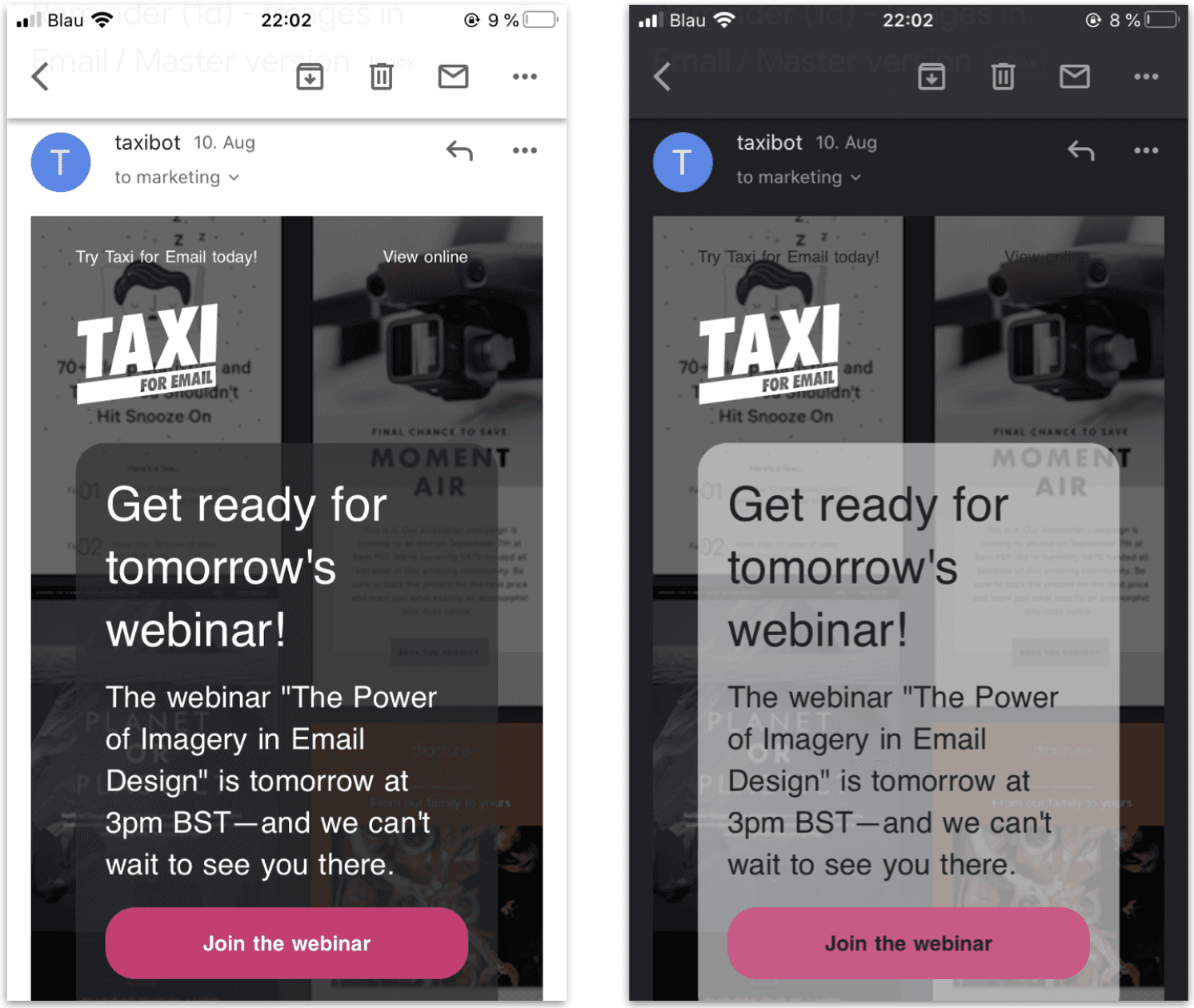
Another option is to add a semi transparent background behind the text and above the background image. So by default, you’ll have white text over a darker background colour. Then in dark mode the text and the background colour will get changed. In turn you’ll be left with black text over a lighter background colour.
Here’s what it looks like on the Gmail app:

However, as with lots of things in email, it’s not quite as simple as this. In Windows 10 mail the background colour will be changed as you’d expect in dark mode, but the text on top of it will stay the same. The only way to get around this is to make sure that you use neutral colours so they will appear clearly in both light and dark modes.
You might also want to think about moving away from using background images with text over the top of them and exploring other design options.
For more information on background images in dark mode check out our blog: https://taxiforemail.com/blog/how-to-make-background-images-work-in-dark-mode/
Think about your brand colours
As well as all of these approaches, it is important to take a step back and see how your brand colours behave in dark mode across different email clients.
Running a render test in tools like Litmus or Email on Acid, or sending a real test send to any inboxes you use, can quickly highlight any potential issues you have in dark mode.
This way you can focus on what, if anything, you need to prioritise when it comes to dark mode. Whether that’s tweaking brand colours, updating icons and logos or reconsidering how you use background images.
Read More:
What is Dark Mode? | Different Email Clients in Dark Mode
